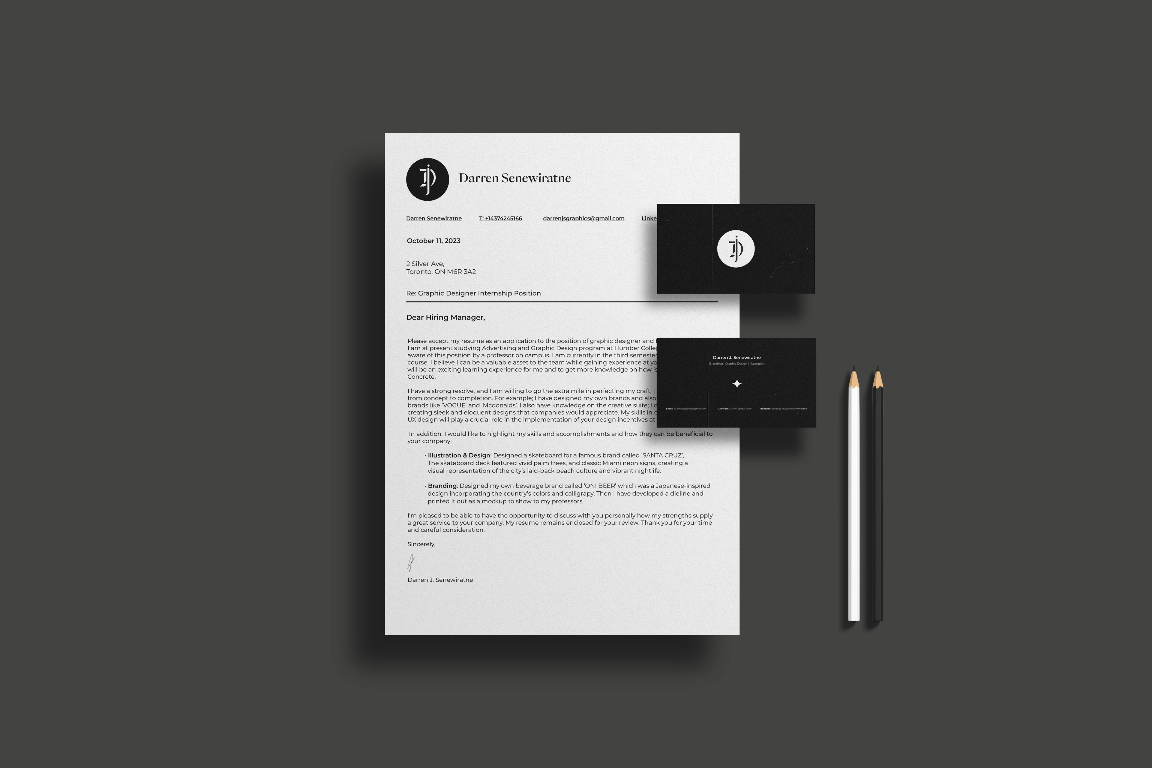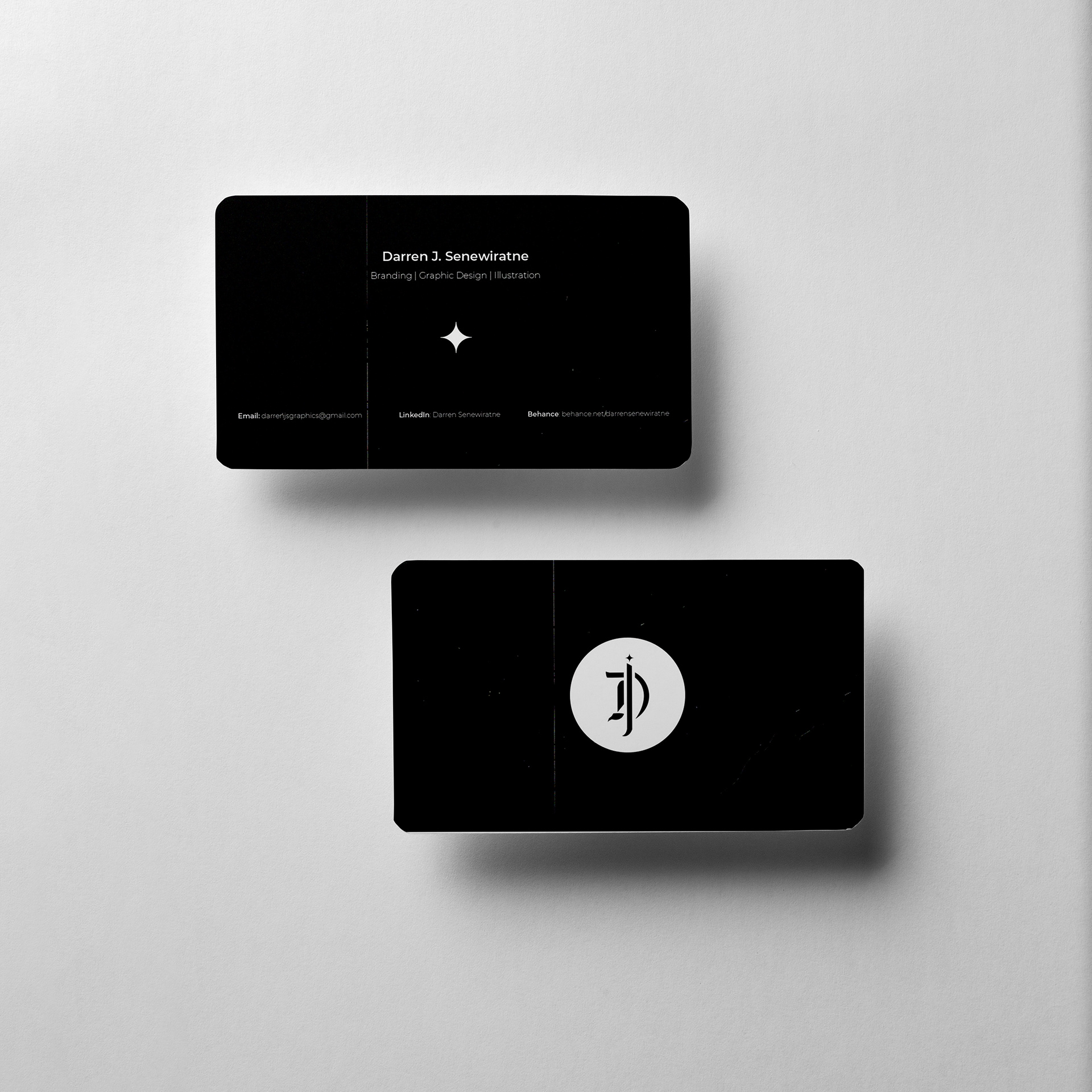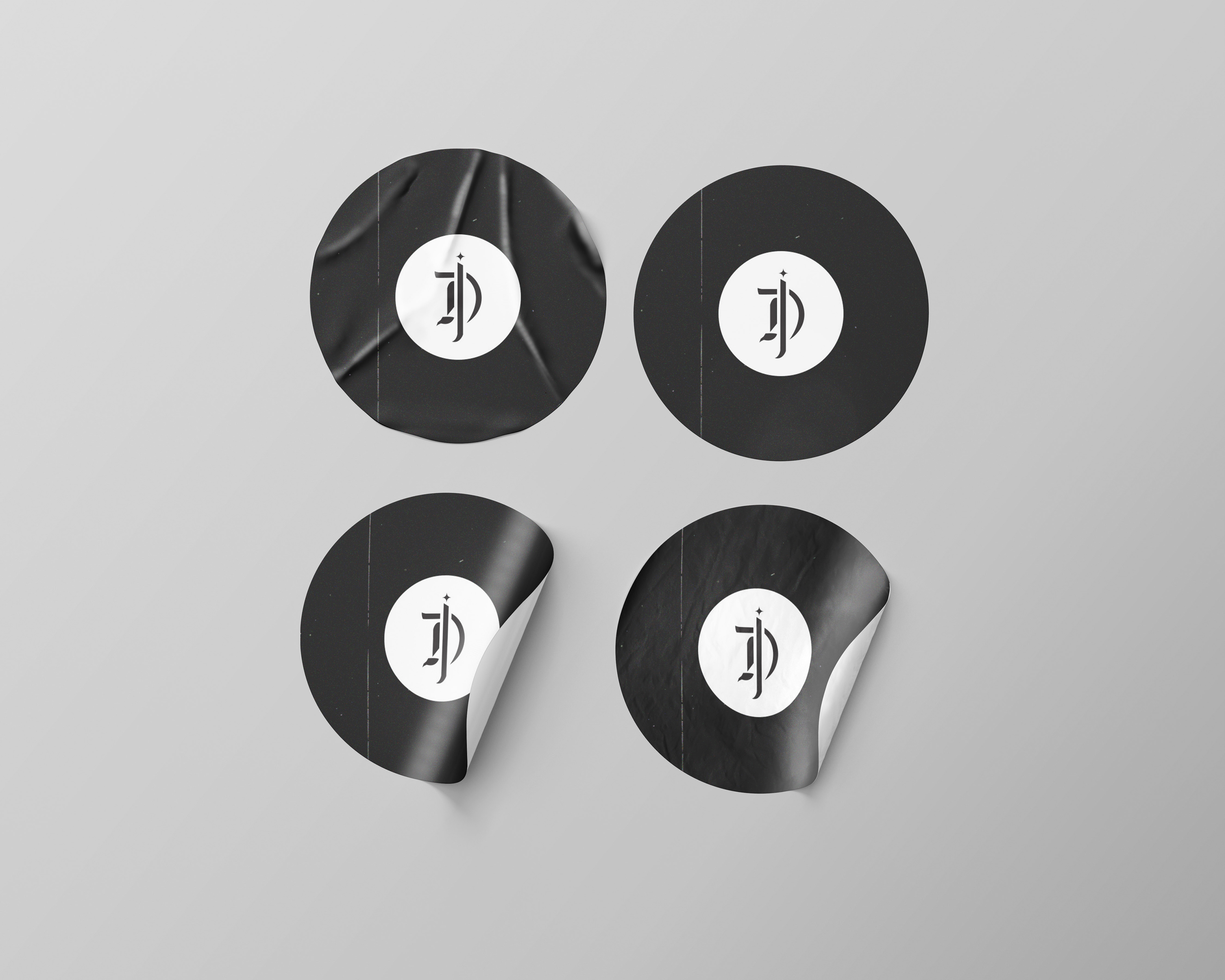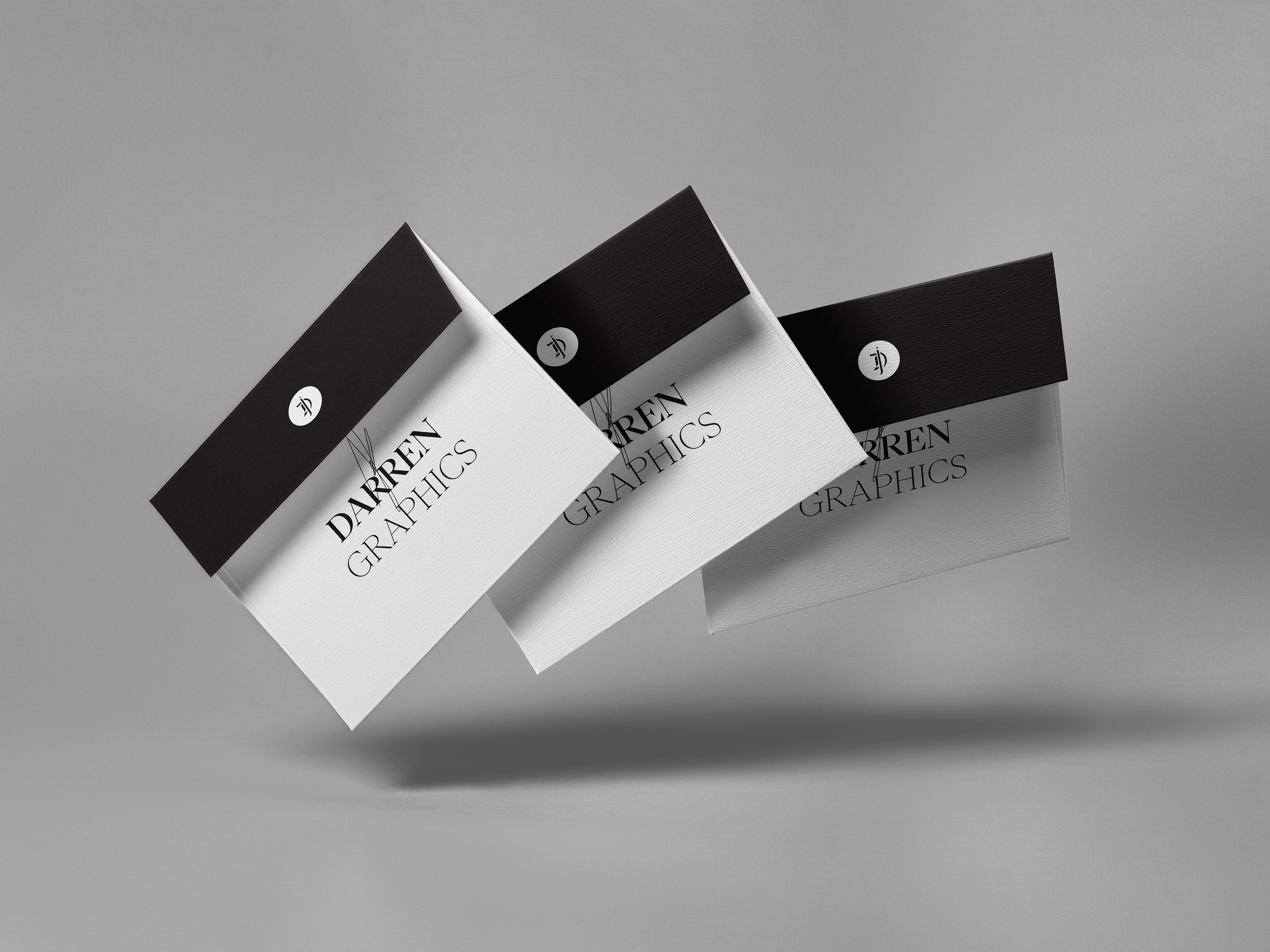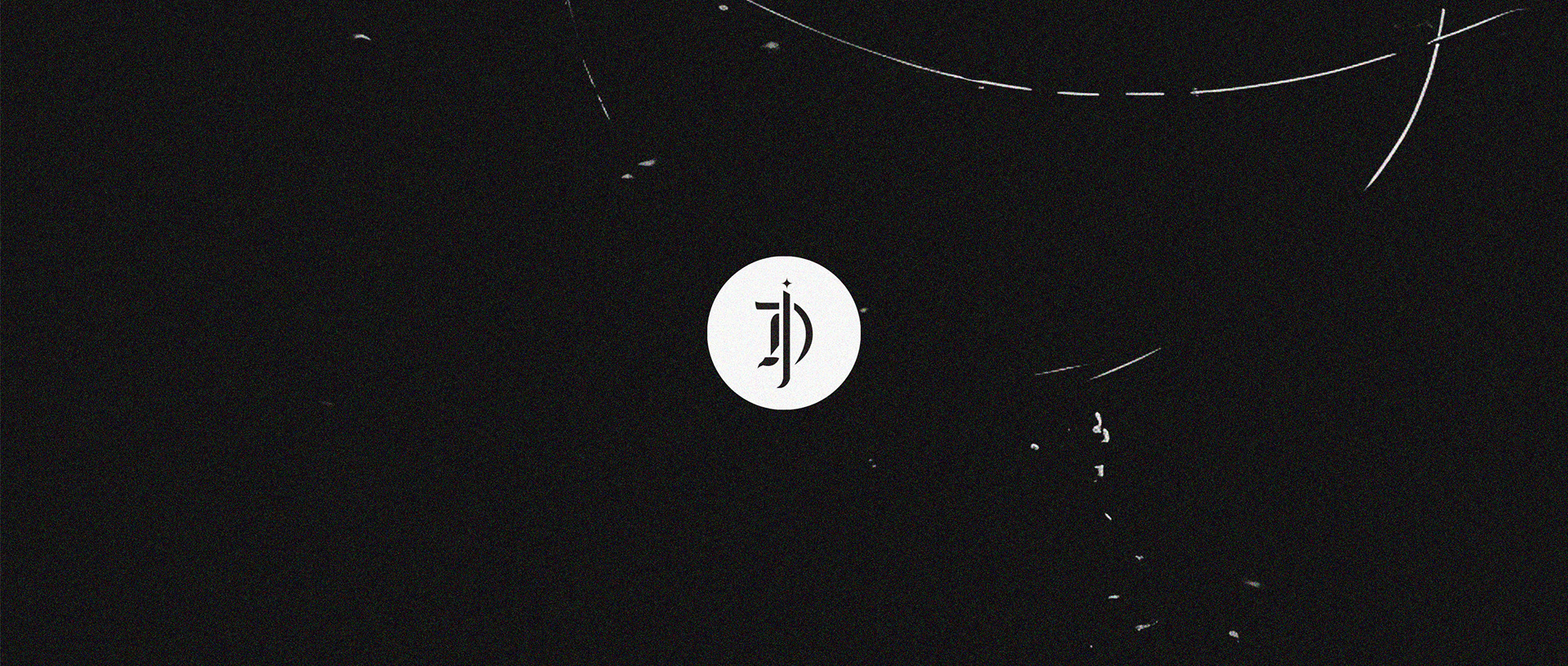


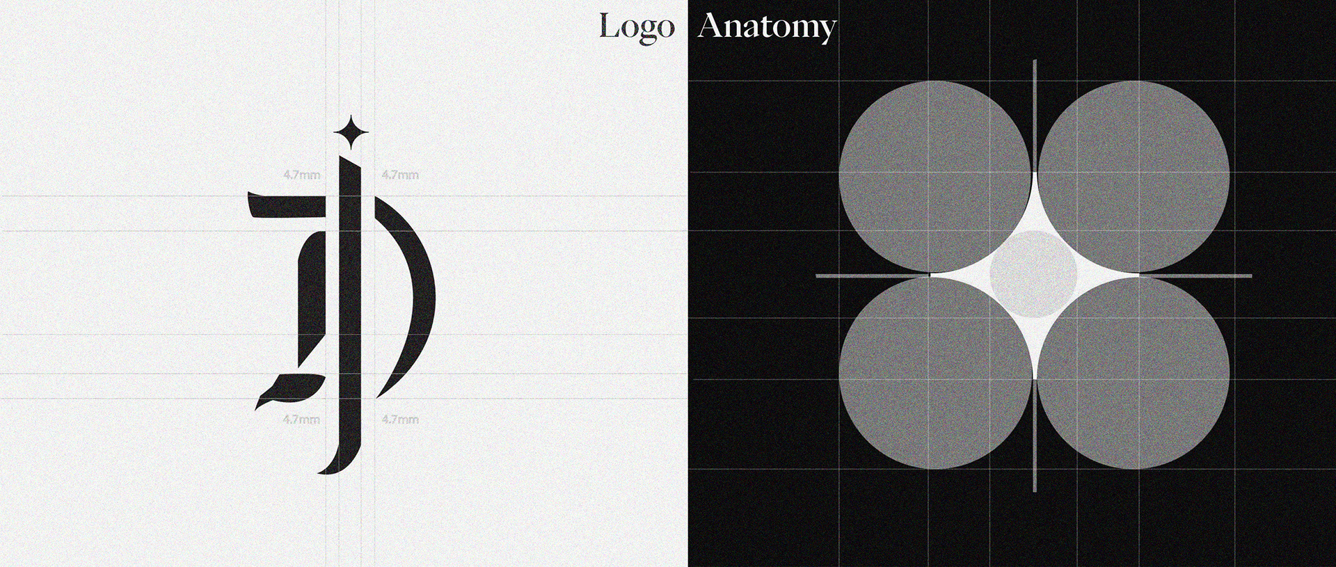
The logo represents the fusion of the initials 'D' and 'J', derived from my first and second names. This deliberate choice reflects my decision to incorporate these initials into the logo design. The letter formation is inspired by the Gothic style, evoking its distinctive aesthetic. This design choice is further enhanced by the utilization of cool black and white tones, thereby imparting an elegant and sophisticated ambiance to the logo.
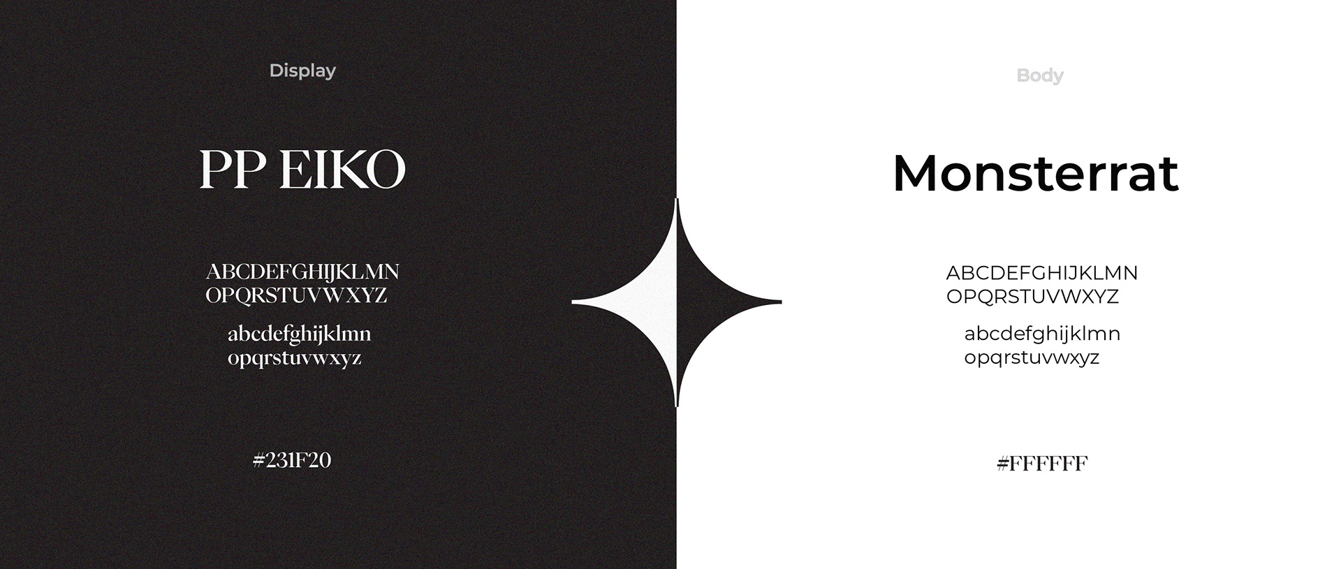
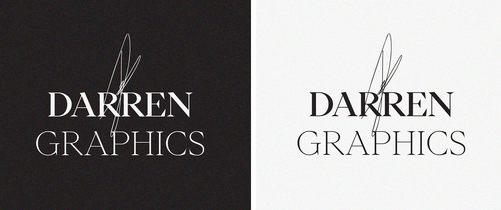
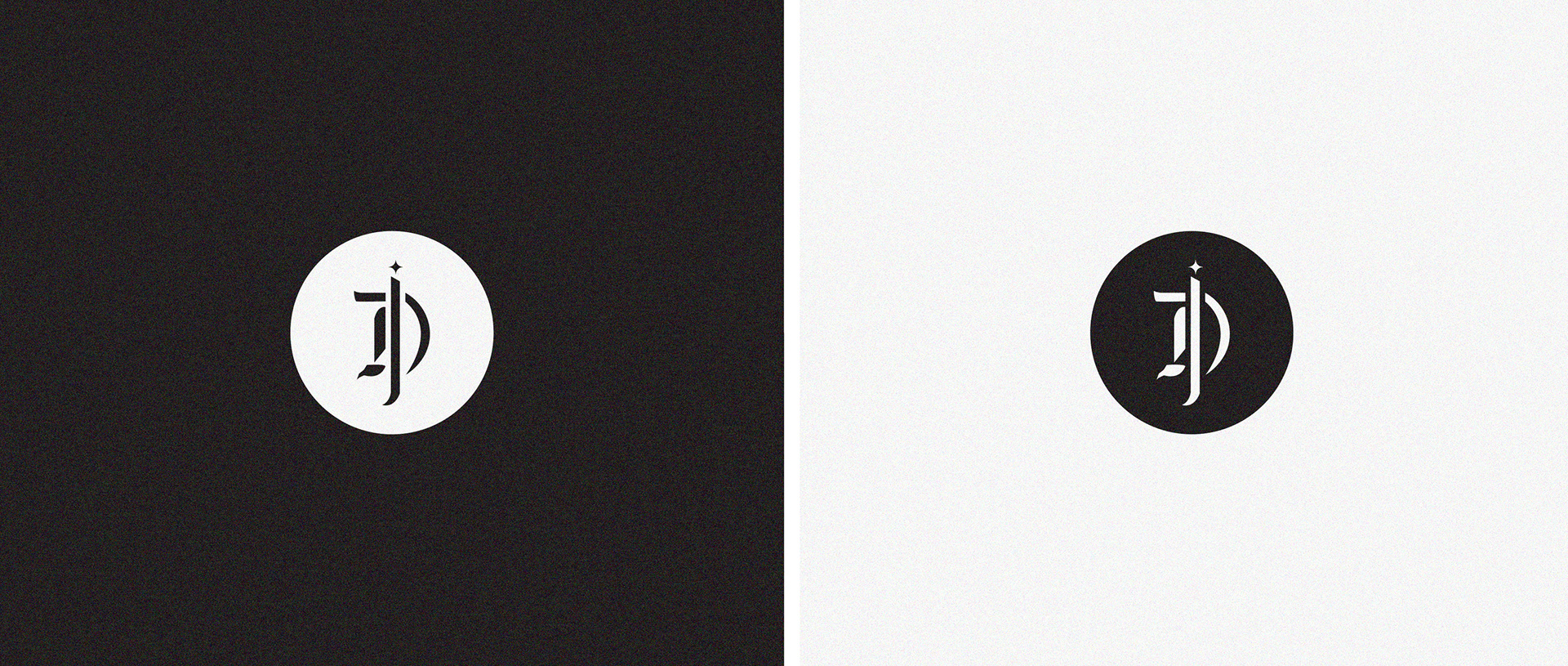
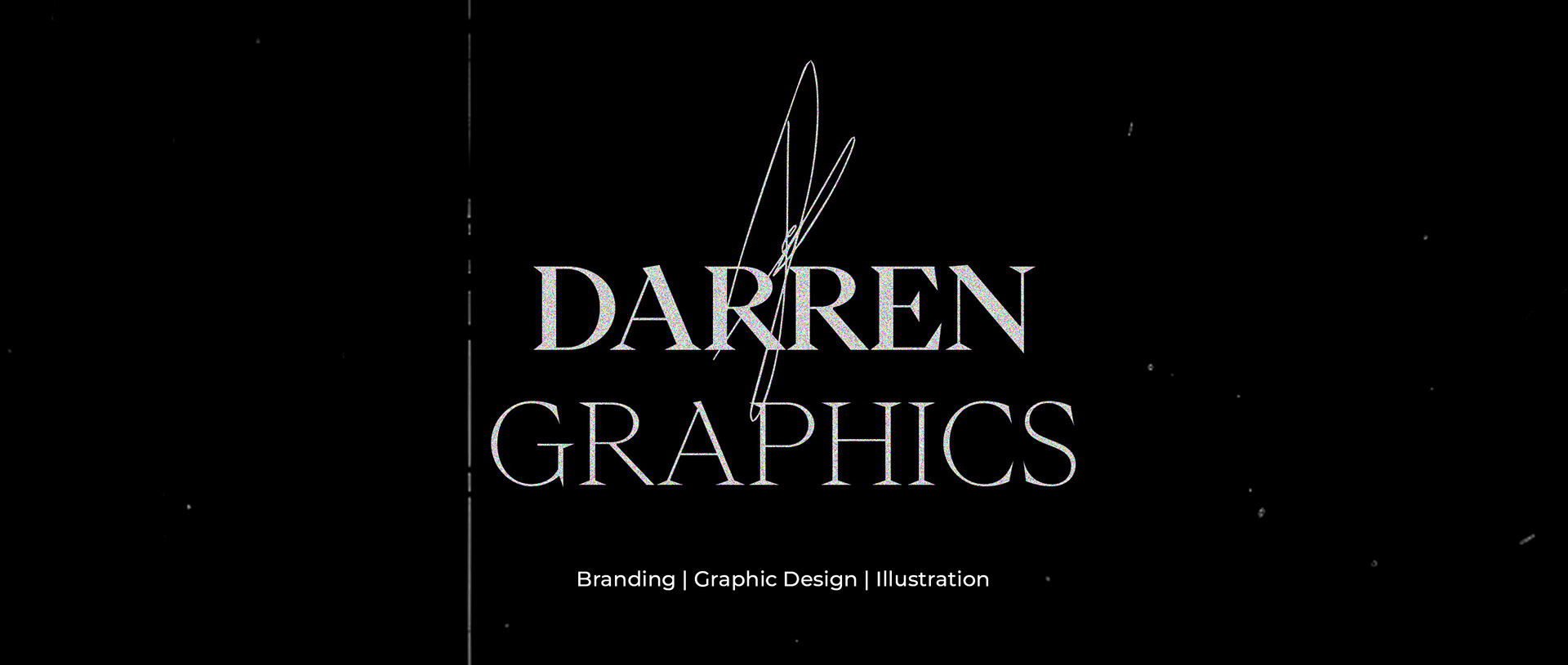
My choice to represent my brand using black and white aims to evoke a timeless, formal, and elegant essence